Quantcast
Channel: Kaper Design; Restaurant & Hospitality Design Inspiration
Viewing all 121 articles
Browse latest View live

Top Hops

$
0
0
Name: Top Hops
Location: NYC, NY
Design: Helm Workshop- Identity


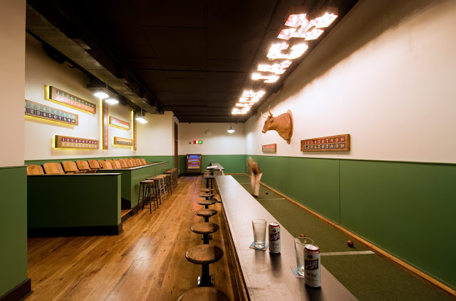
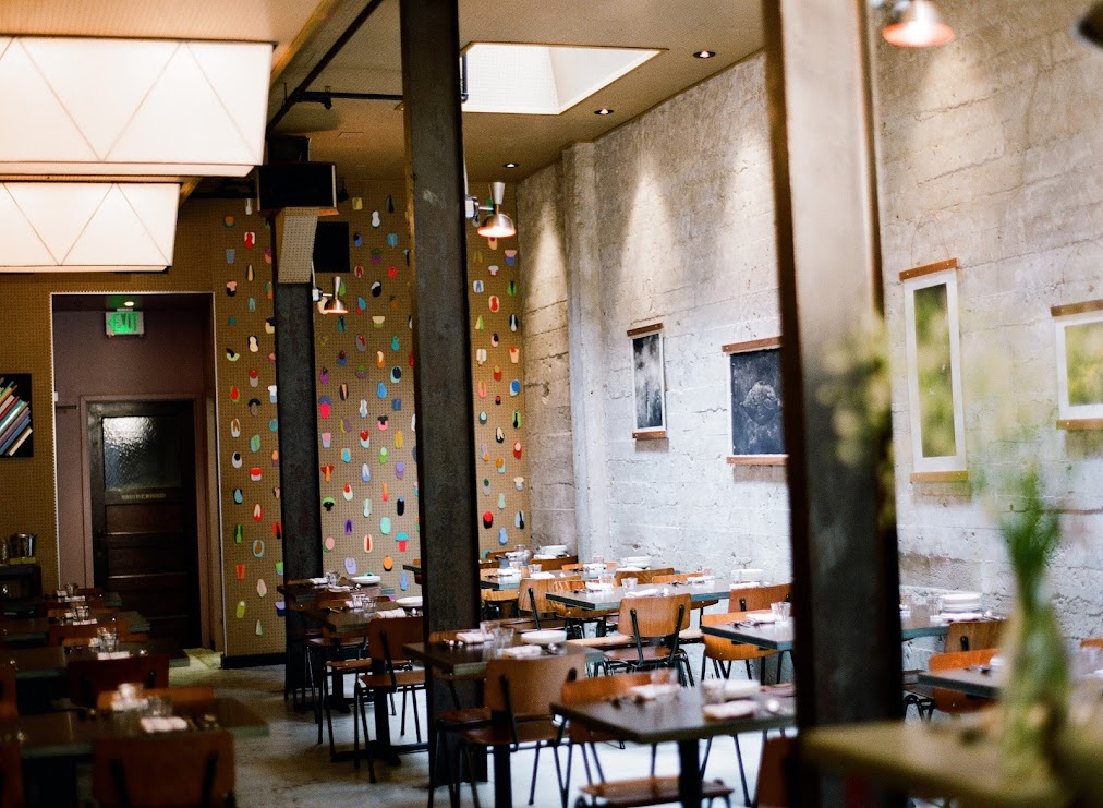
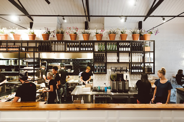
Top Hops is a craft beer goldmine in the heart of NYC. With great identity and branding, along with a functional and well laid out interior, the concept is cohesive and fun.


Brand Identity
I love the structured yet informal nature of the chalkboard menu and enjoy that it provides a great backdrop to the tasting bar and retail. 

Brand Identity
Image 1 © Edible Manhattan
Image 2© lucyeatsveggies
Image 3- 4 ©Helm Workshop

Havens Kitchen

$
0
0
Name: Havens Kitchen
Location: NY, New York


As a cafe, retail, and kitchen space, Havens Kitchen did a great job creating cohesion to three sets of very different functional needs. 


Using the entry for seating and retail with the cafe acting as a buffer between, each space is clearly defined while still remaining harmonious. 

The mix of industrial details, worn woods, and vintage pieces creates a layered and warm space that can appeal to a wide demographic.

Images 1-4 © The Scout Mag

Messhall

$
0
0
Name: Mess Hall
Location: Los Angeles, CA


With a mix of mid century modern and rustic, Messhall creates a space that fits well within it's historic dome roofed structure. 


 Industrial stools, wood clad walls, and a color palate reminiscent of days at camp all come together to form a space much more pulled together than I remember my camp mess hall being!


I love that they used a common, everyday object- the divided dining tray, and created a a great visual that ties into the concept. 


All Images © StudioUnltd


Althaus

$
0
0
Name: Althaus
Location: Gdynia, Poland
Design: PB/Studio with Filip Kozarski


Althaus, a Bavarian restaurant located in Poland executes a rustic and modern interior seamlessly. 


Occupying two levels, the space features traditional materials and rustic touches offset by accent of copper.


The large graphic wood wall ties both upper and lower floors together allowing each to have it's own personality without contradicting the other. 


I love the simplicity of the space and the updated uses of materials. The paneling and banquette are a great example of traditional applications being updated and used to present a modern and fresh perspective. 


All photos © Yatzer

Tørst Beer Bar

$
0
0
Name: Tørst Beer Bar
Design: hOme

Tørst's interior should be able to get just about anyone excited about beer. With a mix of Scandinavian simplicity, geometric woodwork, and a touch of glam the space is a home for beer nerds and design nerd alike.


Keeping the material palate simple allowed for the design team to go over the top with the details. Different patterns on reclaimed wood table tops occupy each different table type while unique medallions and ceiling moldings make sure no surface is overlooked. 


I love the ombre detail and simplicity they achieved with the beers pulls as it echoes the rest of space keeping everything coherent. 


If you are a beer nerd, I highly encourage you to read more about their 'flux capacitor' that is installed under their taps. It allows them to have four different temperatures for serving and controls the nitrogen and carbon dioxide for each individual tap; ensuring the perfect pour.


All images © retaildesignblog

Black Jack

$
0
0
Name: Black Jack
Location: Washington, D.C.
Design: CoreDC


While in DC last week, I had the opportunity to visit Black Jack, located just above Pearl Dive Oyster Bar on 14th street. The attention to detail and reigned in circus theme created a great bar environment that felt fun, but not over the top.


With the front of the space dedicated to a sideshow, circus-esq concept, the back of the space personally stole the show. A full bocce court, old bleacher seating, and barstools created a fun and unique bar experience.


Keeping the color palate reigned in and using images of sideshow acts, helped keep the theme from being over the top while still allowing for key features of traditional circuses like red velvet curtains, draped string lights, and hand painted bar details. 


Images © CoreDC

Spuntino

$
0
0
Name: Spuntino
Location: London


I love the warm, grittiness of Spuntino and enjoy the small scale and intimacy.


Working with the exposed brick, worn subway tiles, and raw nature of the space allows the furnishings and fixtures to be kept simple and unassuming while maintaining the character and rustic nature of the interior.


Image 1 © Pursuitist
Image 2- 4 © Google Image 

Manzanilla

$
0
0
Name: Manzanilla
Location: New York
Design: Meyer Davis


Manzanilla is a Spanish brasserie that creates an intimate environment within its large space.


The chevron tiled floors and warm wood ceiling tie the space together while the multiple seating groups  minimize the impact of the large space.


The attention to detail and contrast of warm and cool materials creates a space appears balanced and energized.


Images 1-3 © Thrillist
Image 4, 5 © Eater NY

James Beard Awards 2013

$
0
0


Just like many others in the food industry, May 6th was spent live streaming & refreshing every social media outlet to get the play by play of the annual James Beard Awards!

While many were awarded, we are always more interested in those that deliver the full package;  great chef, great food, and well designed spaces. Take a look at a few of our favorite winners, after the jump.


*For additional photos, click the photos below.

Best Restaurant Design- under 75 seats
Name: Isa
Location: New York
Design: Taavo Somer


Best Chef in America; Midwest
Name: Stephanie Izard
Restaurant: Girl & the Goat/ Little Goat Bread


Best New Restaurant
Name: State Bird Provisions
Location: San Francisco, CA


Outstanding Chef
Name: Paul Kahan
Restaurants: Blackbird/ Avec/ Publican/ PQM


Mighty Quinn's

$
0
0
Name: Mighty Quinn's
Location: New York, NY


Mighty Quinn's has taken barbecue into a new realm in NYC; allowing great products in a great atmosphere while still keeping quick service. The monochromatic palate and limited material usage allows for a cohesive and simple space that still feels on trend.


The reclaimed wood tables were created from salvaged wood from The Puck building in downtown NYC and add a level of warmth to the space. Balancing the wood with metal and gray keeps the space relevant and timeless. 


All images © Eater NY

Wee Jeanie

$
0
0
Name: Wee Jeanie
Location: Melbourne, Australia
Photos: Erika Hildegard Photography


Located close to the Yarraville train station, Wee Jeanie is a great spot to grab your morning coffee. 


The interior is bright and classic with minimal details and allows you to feel as if you are sitting in your own kitchen, sunshine streaming through the windows. 


The exposed, worn brick adds a touch of warmth to the otherwise white space while the stacked bond tile add a slight modern touch.


I love the bright back patio and how they bridged the interior and exterior with a leaning edge on both sides. The acrylic table top and wood truss base also point the subtle modern/rustic mix happening throughout the space.


Hock Farms

$
0
0
Name: Hock Farms
Location: Sacremento, CA
Design: Beta Form Industries


Hock Farms is a bright & slightly modern space that still captures a bit of rustic warmth within it's walls.


The added brick gives the interior some texture while painting it white does a great job at brightening the space. 


I love the rustic details and texture of fabrics used as they layer multiple styles allowing the space to feel inviting and comfortable.


The pop of blue in the center of the space is a welcome break from the monochrome interior and adds a bit of definition among seating groups.


All photos © Kat Alves via Remodelista

Fonda

$
0
0
Name: Fonda Mexican
Location: Melbourne, Australia
Design: Techne Architects


Fonda Mexican's second location showcases a great example of a modern, vibrant interior utilizing texture and a minimalist color palate.


The modern and clean lines of the existing structure translate well to the the rest of the space and add an element of vibrancy and excitement. Juxtaposed with just a few rustic touches throughout *wood countertops and bar front primarily) adds just enough balance to warm up the primarily white space. 

All images © Weheart

A Concept Divided; Origo

$
0
0
Name: Origo
Location: Bucharest, Romania
Design: Lama Architectura


A trend I've been watching for a while now is duel-concepts under a single roof. If done well, they can offer the owner maximum ROI, attract a larger demographic, and merge interests. Origo, in Romania has done just this by splitting their space and concept by time; coffee shop in the morning, cocktail bar at night. 


Keeping the space minimal allows for both concepts to operate within the space space, utilizing the same fixtures and furnishings. A heavy handed use of wood and raw metal are contrasted by cups and saucers artfully displayed from the ceiling. Once again proving the benefit of repetition with a everyday object.  By keeping all art limited to the cup/saucer installation, it allows the space to remain focused and draws the users eye up to the original beam ceiling uncovered during construction.


Maximizing seating using bar height and banquette styles also keeps the space open and draws the eye through the space, downplaying its lack of width and focusing on its exaggerated length.


All photos © We Heart


Riffle NW

$
0
0
Name: Riffle NW
Location: Portland, OR


A well thought through concept is one where the restaurant owners consider all components of a guests' meal. From entry and exterior vantages, graphic design, and interior design, all the way to tableware, servers outfits, and take away, all components add up to create a cohesive concept. Riffle NW is a great example of a restaurant thinking through executing each of these components extremely well, providing a completely cohesive dining experience.


The nautical nature of Riffle's space blends perfectly with the raw bar and seafood heavy menu being served. 


The light wood, sail cloth seating and dividers, and numerical table graphics all play off each other to create a comfortable and bright space that reflects the nautical nature but doesn't overdo it.


Sticking to the turquoise and orange color scheme in their graphic and identity design tie into the colors used with the space once again adding another level of cohesion to the dining experience.


The drink menus are cleverly hidden away and remind me of pulling up a trap to discover what you've caught. 


Image 2-3, 5 © Eater Portland
Image 1, 4, 6-8  @ Behance


Moustache Milk + Cookie Bar

$
0
0
Name: Moustache Milk + Cookie Bar
Location: Auckland, NZ


 While literal, the milk bottle light fixture sums up and drives home the concept. Keeping all of the interior fittings and furnishings very modular helps create untidy within the small space while still allowing a small amount of seating.


A fun break from the normal, Moustache Milk & Cookie Bar has created a playful interior filled with colorful notes.


Images © Architecturenow


The General Muir

$
0
0
Name: The General Muir
Location: Atlanta, GA


As a modern take on a Jewish deli, the interior of The General Muir looks just as appetizing as the food. With classic details like subway tiles and checkerboard floors, the space feels rooted in tradition while still keeping a firm grasp on the dining pulse.


Keeping the color palate restricted helps keep the interior feeling modern while the bronze details help add a classically aged note. The marble toped bar, vintage inspired bar stools, and globe lights all work together to create layers within the space. 


All images © Eater Atlanta

Local Favorite: Bow Truss

$
0
0
Name: Bow Truss
Location: Chicago, IL


With NeoCon just around the corner, I wanted to give all those headed into town a look at one of my favorite coffee shops near the Mart.

Bow Truss is a local, small batch roaster with two locations in Chicago. While both serve amazing coffee, their newest location in River North is the stand out in terms of design. 


A smaller space than their original, the River North location still maintains the rustic, reclaimed, and hip nature the original East Lakeview location is known for but does it a more thoughtful and concentrated manor. 


Images © Zagat, Doejo

The Riding House Cafe

$
0
0
Name: The Riding House Cafe
Location: London
Architect: Lou Davis


Classic style lovingly pairs with vintage wares at The Riding House Cafe. Repurposed theater chairs, industrial accents, and rich wood layer together to create a warm and welcoming space.


The pop of blue found on the barstools and tile border add a refreshing contrast to the warm wood and industrial accents.


Industrial open shelving located at the kitchen pass and behind the bar add enough weight to provide visual separation while still allowing light and sight lines into the spaces.


Curated chotchkies; one of the very few examples of this done well within a restaurant space due to it's restricted nature.


Local favorite; The Purple Pig

$
0
0
Name: The Purple Pig
Location: Chicago, IL


The Purple Pig is easily one of my favorite dining spots in the city. With an intimate and warm space, great wine list, and fun menu it easily fits the bill for just about any occasion. Even with an hour average wait time (every day, all year long…), The Purple Pig is the restaurant we frequent the most often and the place we are most likely to take visitors.


With an extremely small space, seating was maximized by using long community table in the middle of the space. Paired with a few two and four tops (and the outdoor patio in the summer.) allows them to accommodate almost any size group and helps turn over tables relatively quickly and efficiently.  

The spanish tiles add a bit of playfulness to the space while the wine barrels and art work all play on the literal side of their motto 'Cheese, Wine, & Swine'.


Viewing all 121 articles
Browse latest View live


Latest Images