Quantcast
Channel: Kaper Design; Restaurant & Hospitality Design Inspiration
Viewing all 121 articles
Browse latest View live

Southeast Wine Collective

$
0
0

Location: Portland, OR


Southeast Wine Collective has created an urban tasting room, bringing together four local wineries.
The space is a blend of urban warehouse and warm tasting room and use the wine as both displays and focal points. 


The main tasting bar uses wine barrels as shelving and texture. Wine stored bottom out creates a great visual flanking each side. 


The space also created multiple seating types including banquette, bar, and community table seating. All of these allow the tasting room to offer multiple experiences and host different events.


All images © Eater PDX

Loveland Ale Works

$
0
0


Name: Loveland Ale Works
Location: Loveland, CO
Identity: Manual

Loveland Ale Works is a small batch brewery inspired by European & American style brews. Through graphic design and interior design, they were able to create a cohesive vision.


Inspired by the history of Loveland as a town founded due to the Colorado Central Railroad and gateway to Rocky Mountain National Park, they used elements throughout that play back to these ideas.


The tap handles were created based on the 19th century signal levers & the logo itself plays homage to the mountains and railway.


The interior was left clean and simple using raw materials to enhance the handcrafted feel. Reclaimed woods, concrete, and plywood signs all come together within the exposed brick space.


Images 1-3© Loveland Ale Works
Images 4-12 © Manual

Kiosk

$
0
0
Name: Kiosk
Location: Strasbourg, France


Kiosk was created based on the idea that everyone has a favorite little diner. One that is small and comfortable and makes you want to return time after time. 
With touches of mid century modern, Kiosk puts a fresh spin on the classic concept.


The use of butcher block and blond wood helps balance the small space While the globe pendants and curved lines evoke the classic mid century modern appeal.


All photos © behance

Homa

$
0
0
Name: Homa
Location: London


Homa is a Mediterranean Brasserie with a clean, curated interior. 


Using local architects, designers, and sources for furniture, the space remains rooted in the community.


The mismatch of chairs and tables corresponds well with the bright interior and is curated just enough to still create a consistent feel without getting too busy or cluttered.


Images 1, 3 & 5 @ Homa
Image 2, 4 © Editor


The Hardware Society

$
0
0
Name: The Hardware Society
Location: Melbourne, Australia
Photo Credits: Erika Hildegard Johnson


The Hardware Society is located along a nondescript alley with only a single small sign, letting you know you've arrived. Once inside though, you are greeted with an open and bright space with a modern meets rustic aesthetic.


Though they used a wide material palate, the space remains streamlined and consistent through the controlled color palate of grey, black, white and yellow. 


The use of the large scale brocade wall paper contrasts and balances the rustic wood and open displays of goods.


The accent lighting and displays within the space balance out the modern components by adding a touch of fun and whimsy.


Astro Coffee

$
0
0
Name: Astro Coffee
Location: Detroit, MI


As a Michigan native, I've always had a soft spot for Detroit. While the news might lead you to believe its a city losing hope, places like Astro Coffee and other Cork Town favorites are slowly but surely revitalizing the area.


Astro uses the classic subway tile, chalkboard, and industrial pendant combination to creaet a Brooklyn-worthy space in the heart of Detroit. I love the wood clad bar and changing typography that graces the huge chalkboard wall. The exposed brick and vintage industrial furniture all lend well to the welcoming neighborly feel the space overflows with.


Image 1 © Astro Coffee
Image 2 © Hour Detroit
Image 3 © Flickr
Image 4 © Shark & Minnow


Toby's Estate

$
0
0
Name: Toby's Estate
Location: Williamsburg, Brooklyn
Design: Nema


As the American flagship for Australian coffee, Toby's Estate is a comfortable and curated space.


I enjoy that the shelving and retail space was treated as if it could be in your home, rather than a cafe. 


Toby's Estate hopes to be a location for coffee and coffee education and features a long marble toped bar with pour-over and espresso making on display. It also features a separate room designed for classes and exploring the world of coffee further.


 Using primarily off the shelf solutions, they managed to curate a space that feels cohesive and welcoming.

All images © Dwell

The Little Mule

$
0
0
Name: The Little Mule
Location: Melbourne, Australia


Combining two of my loves; coffee & bicycles, Little Mule creates a rustic and warm space tucked away in a small alley way in Melbourne.


As a custom bike shop and cafe, Little Mule serves coffee and food while crafting custom bikes and selling accessories.


The exterior garage door lifts open during business hours allowing you to order right from the street. (very San Francisco-esq; probably another reason why I find the space so charming.)


The interior space is a mix of rustic, custom-built tables and mismatched industrial stools, with bikes hanging on the walls.

Not overly done, Little Mule creates an inviting and rustic space filled with hand crafted details true to their bike building origins. 

Branding the business with their simple logo, allows cohesion within the space as well and creates a graphic backdrop from the street.


Oyster House

$
0
0
Name: Oyster House
Location: Philadelphia, PA

,
Oyster House, located in Philadelphia, is a great example of a small space that doesn't sacrifice on style.
Blending nautical, traditional, and industrial design components they have created a balanced and inviting local spot.

I love that the oyster bar is on full display and allows for enough room to properly display the beautiful catch, and craft of preparation.


The classic white subway tile creates a texture to the walls that contrasts the rich table and Thonet-style barstools.


The industrial pendants and light fixtures are balanced by the intricate moldings and traditional furnishings.


All photos © Oyster House


Laurel Hardware

$
0
0
Name: Laurel Hardware
Location: West Hollywood, CA
Design: Sam Marshall


Located inside of a converted hardware store, appropriately named Laurel Hardware creates a space with a great mix of industrial and vintage.


When repurposing the space, they kept true to its industrial and warehouse beginnings while adding large windows to both sides connecting diners to the outside.


Large expanses of floral wallpaper and reclaimed wood add a touch of girly chic to balance out the exposed wood beams and industrial furnishings.


Keeping the materials natural and the addition of large windows keeps the space bright and inviting.


Image 1, 3, 4 © Remodelista
Images 2, 5, 6 © LA Confidential

Pallet

$
0
0
Name: Pallet
Location: Salt Lake City, UT
Design: City Home Collective

Pallet does a great job mixing industrial with rustic to create a space that appears welcoming and urban.


Using multiple table and seating types, they were able to visually divide up the space into more intimate groupings.


Keeping a simple material and color palate allows the space to not get too busy while also keeping it cohesive. 


All photos © Pallet

Patricia Coffee

$
0
0
Name: Patricia Coffee
Location: Melbourne, Australia
Design: Foolscap
Photography: Erika Hildegard


One of the greatest components of being a part of a creative community is the creative collaborations we get to facilitate and participate in. Our friend Erika, is an extremely talented photographer and just relocated to Melbourne, Australia. We couldn't wait to see the adventure through her lens, and decided to team up to bring our readers a few intimate looks inside some of Melbourne favorite spots.


Patricia coffee is a small cafe located on the corner Little Bourke & Little Williams and focuses on providing great coffee with little distraction.


Patricia's small space allows for 'standing room only' in order to focus on simplicity and producing a great cup of coffee.


The space merges traditional with new just as the coffee served bridges the traditional coffee experience with the bustling new coffee scene in Melbourne.


Simple details, a restrained color palate, and modern touches create a rich space that still feels open and inviting. 


I love the creative use of simple tile to create a more detailed pattern which acts as a simple backdrop to the coffee production. 


Mexout

$
0
0
Name: Mexout
Location: Singapore
Graphic Design: Bravo Company

Mexout goes against the grain to create an urban interior paired perfectly with a purposefully imperfect branding scheme. 


Creating an industrial and urban space, Mexout is casual while still remaining tailored and thoughtful. The team behind the graphics created 20 different logos that all work in conjunction, or separately, which continue the urban and young feel of the interior and concept.


Keeping the color and material palate limited and selective, balances the multiple logos and branding efforts taking place. The interior does a great job crafting a space that feels hip and laid back, but also tailored and thought through.


Littleneck

$
0
0
Name: Littleneck
Location: Brooklyn


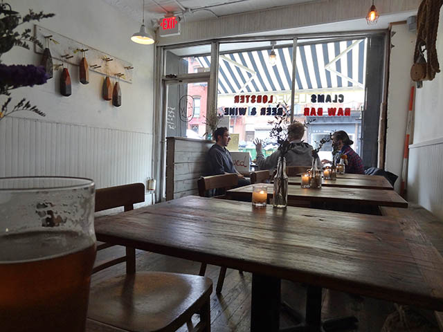
Littleneck has created the perfect roadside seafood shack in the middle of Brookyln, that could cure any quick craving for the East Coast you may be having. 


 02 Littleneck Brooklyn

White washed, half paneled walls, dark worn wood furniture, ropes, bouts, and cage lights keep the space minimal with just enough touches of East Coast roadside charm. This space is successful simply because they stayed true to their concept. There is nothing over done and there was enough thought put into the space to appear intentional and cohesive with the food being served and original concept.


Photos 1, 3 @ Eater
Photo 2 @ Me So Hungry

Mosto Tequila + Botanas Bar

$
0
0
Name: Mosto Tequila + Botanas Bar
Location: San Francisco, CA


Tacolicious, a San Francisco favorite, created it's fourth locations recently in the Mission. Located at the back of the Tacolicious space is tequila bar, Mosto. The narrow bar maximized it's small footprint with minimal seating and eye catching details.


Using over 3,000 Mason jars, the bar created a texture and pattern along the ceiling, drawing your eye up towards their display of extensive Mexican liquors. 

Utilizing the bar height banquette and backless stools allows for minimal interruptions along the narrow space while maximizing seating.


Image 1 © Inside scoop SF
Image 2 © Bon Appetit
Image 3 © Sosh
Image 4 © Scout


Dock Kitchen

$
0
0
Name: Dock Kitchen
Location: London


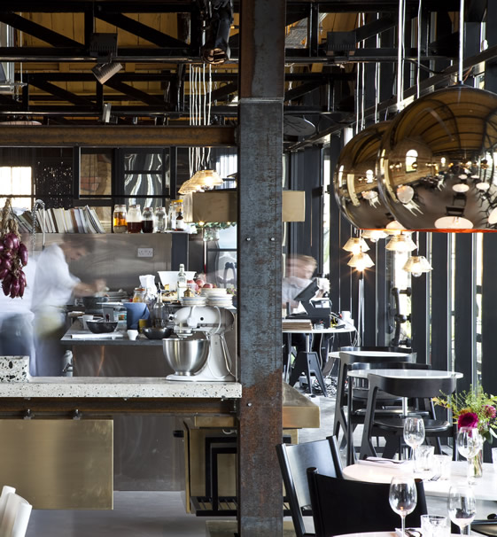
With a beautiful location and proximity to Tom Dixon's shop, Dock Kitchen was set up for success from the beginning. With exposed brick walls, a spectacular view, and attention to detail the space strikes a beautiful balance of refined rustic.


The truly welcoming open kitchen gives off the feeling of being in a friends kitchen. Balanced with the quality of materials used in the dining room and clean lines and polished details of the dining room, the space feels upscale and memorable while also feeling comfortable and welcoming.


I love the simplicity of the space and enjoy that the truss's, ceiling, and walls were all left exposed, highlighting the original structure and history of the space.


Image 1-3 © The Selby
Image 4- © Weheart

Lokaal

$
0
0
Name: Lokaal
Location: Rotterdam, Netherland
Design: Weaponofchoice


Located under an old rail line, the goal was to create an interior reminiscent of the canteens of classic rail stations throughout Europe. Using a minimalist and quality material palate, they were able to create a structured and refined cafe space.  


Keeping the interior minimal with a focus on high quality materials, the space feels timeless and inviting.


Creating branding and printed goods to correlate with the interior keep the message strong and allow for cohesion within the space.


I love that they were able to create subtle pattern and texture by using the inherent properties of their materials. It allows the space to feel cohesive while keeping visual interest. 


All images © Weaponofchoice


Brother baba Budan

$
0
0
Name: Brother Baba Budan
Location: Melbourne, Australia
Photography: Erika Hildegard


Located along the tiny alley of Little Bourke Street, Brother Baba Budan is a small cafe with a big personality.  


Having a small footprint, creativity is shown through the use of common materials, in this case; chairs, used in uncommon ways. By placing the chairs on the ceiling, it creates a texture and pattern and draws the eye up, emphasizing the spaces height. 


Placing shelving and displays at a higher vantage point also frees up the floor space they do have to allow for quick grab and go coffee and a small community table in the center of the space.


Using wood as the primary build-out material and leaving the walls relatively raw, they were able to create a hip and urban space that keeps the focus on the coffee.


 All photos © Erika Hildegard

Town Mouse

$
0
0
Name: The Town Mouse
Location: Melbourne, Australia
Graphic Design: A friend of mine


Once again, a great example of typography and identity going hand in hand with restaurant design. The Town Mouse, located in Melbourne, took a simple color palate and created an interior that was relevant, fun, and modern.


The central bar allows for a multitude of activities while also providing a great amount of seating.


I love the square, gloss tiles that were used throughout the space. They create cohesion and deliver a great backdrop for the typography.


Images 1,4-7 © Broadstreet
Images 2,3 © A friend of mine

Pescatore

$
0
0
Name: Pescatore
Location: Poland
Design: Loft


Located in the Mera Hotel & Spa, Pescatore stands above most restaurant bars with its classic and modern design. 


The monochromatic color palate, simple material palate, and use of pattern create a space that feels timeless with a touch of modern. 


The gingham table clothes paired with the distressed wall paneling add a slight touch of rustic to the mix, creating a layered and refined space.


Viewing all 121 articles
Browse latest View live


Latest Images