Quantcast
Channel: Kaper Design; Restaurant & Hospitality Design Inspiration
Viewing all 121 articles
Browse latest View live

LA Condesa

$
0
0
Name: La Condesa
Location: Austin, TX
Design: Joel Mozersky& Michael Hsu 


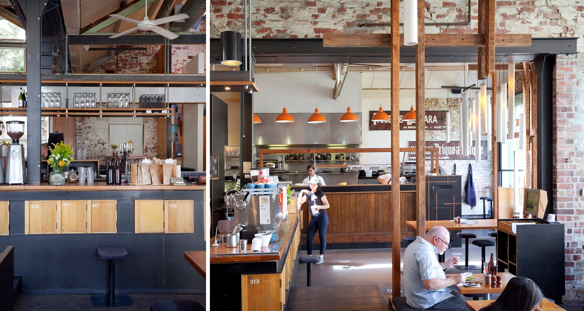
Colorful and retro with a touch of eclectic works perfectly for Tex Mex restaurant, La Condesa. Layering industrial materials with soft leathers and bright colors creates a warm and vibrant space fitting of the food. 


The bright colors and modern architecture work well to create an energetic interior. Old Mexican billboards found new life as they were broken down and reassembled into a  large, can't be missed, mural on the far wall. 

The vintage vibe and playful lines also help keep the space upbeat, bright and inviting. We love the layering of materials and the texture and comfort level it brings to the interior. 


Bar Sajor

$
0
0
Name: Bar Sajor
Location: Seattle, Wa
Design:

Matt Dillon, 2012 James Beard Award Winner and chef/restauranteur behind Sitka and Spruce, opened up Bar Sajor early this year in Pioneer square.  With a similar open kitchen layout and earthy lightness, the interior feels like a more 'dressed up' version of Sitka & Spruce in all the right ways.


Using blonde woods, white bead board, and cool grays keeps the space chic and polished while remaining warm. The exposed rotisserie oven and exposed wood beams add a rustic touch that help keep the interior tied to the buildings historic roots. 


Images 1 & 2 © Architectural Digest
Image 3 © Eater Seattle
Image 4 © Bon Appetite

Our Work: Foursided

$
0
0
Name: Foursided
Location: Chicago, IL
Design: Kaper Design, LLC
Photography: Kyle McKenna


Kaper Design is excited to share our latest work in Chicago! Located in the heart of East Lakeview (Just a few blocks down from Dryhop, too.), Foursided is a neighborhood staple for those looking to get the best framing or unique gift. Being the original location, it came time for a facelift and we were happy to jump on board. Follow the jump below for a look at their new space.


In order to bridge functionality with aesthetic, we created zones and divided the space into a private back workroom and public front of space retail section. Dividing the two areas allows works to spread out and get creative while creating a determined area for customers to meander. Custom steel and metal shelving units were fabricated to add vertical storage. These pieces add warmth while remaining light, allowing your eye to focus on the good placed on them. 

On of my favorite components of the space is the large, sliding panels which now display the extensive frame sample collection. Utilizing a custom designed steel track system (Similar to a school house blackboard), allows us to minimize the amount of square footage needed to display the frames while still keeping them easily accessible for employees and guests.


Custom designed and built shelving in the center of the space adds display and retail space while also keeping customer traffic flowing through the space. The counters were custom designed and fabricated by Fourth lake Carpentry Inc. and grant us lots of extra storage space for frame samples and prints. 


The front of the store received a brand new facade, tile entry way, and raised displays. Paired with the removal of the awnings the space is now clearly visible to all passing by.


Damson & Co

$
0
0
Name: Damson & Co
Location: London
Design: Central Design Studio


Damson & Co has done a great job layering multiple styles together to create a warm and classic space. 
Industrial and classic touches add depth and visual interest to the otherwise utilitarian interior.


The millwork details located at the bar are one of my favorite parts of this space. They are traditional in most aspects but make a slight nod towards industrial. Paired with the custom light fixtures at the bar top you get a space that feels familiar but on trend. 


The tile detail located at the foot of the bar adds definition to the space while remaining simple and clean lined, much like the remainder of the utilitarian interior. 


Images 1-4,6 © Timeout Magazine
Image 5 © Indigo Memoirs
Images 3, 5,7 © Central Design Studio

Truth Coffee Shop

$
0
0
Name: Truth Coffee Shop
Location: Cape Town, South Africa
Design: Haldane Martin


One of the most noticeable trends throughout the world currently is the influx of industrial. With a raw nature, truth of materials, and authenticity it is easy to see how so many have grown to love this aesthetic. As with any trend, there grows the group of people who yearn to be different and to expand past what is 'trendy'. One of the most common trends I see coming into favor is Steampunk. While I can see direct link from industrial to steampunk, I feel the need to stress that these two styles are by no means the same. Truth Coffee Shop is a great example of what steampunk represents and showcases the differences between the two styles flawlessly. 


The steampunk style relies heavily on the mixture science fiction and steam powered machinery. Blurring the line between industry and decoration, steampunk can incorporate a varying degree of components and characteristics. 


While both styles showcase natural woods and metals, steampunk does so in a mechanical way. Touches of Victorian and Art Nouveau can be witnessed through the rich hues, ornate details, and elaborate curves. 


What I love about the Truth Coffee space is that they took the machinery and components of coffee roasting and brewing and used them as inspiration for their steampunk interior. By imagining these machines as both form and function, they crafted a space that perfectly blends the machinery with the art of coffee. 


All images © This is colossal

Essex

$
0
0
Name: Essex
Location: Seattle, WA
Design: tbD


Essex, located near the Ballard area of Seattle, is a bright and inviting space that has quickly made it on my 'I need to get there' list. Playing with contrast to create balance created a welcoming space.


While utilitarian in nature, playing with geometrics and warm colors woods helps the interior come alive. 


The contrast between the warm woods and bright whites of the back bar and countertops helps to maintain the brightness within the space while also creating a balanced and cohesive interior. 


Ranger Station

$
0
0
Name: Ranger Station
Location: Snowmass, CO
Design: Scout Regalia


As quickly as winter has appeared, so too have the thoughts of a snowy mountain getaway. New Belgium's Ranger Station, located near lifts at Snowmass Village, has the rustic yet contemporary vibe that is the perfect aesthetic for it's mountain local. 


Balancing a utilitarian and rustic interior creates a modern take on the traditional ski lodge. 


I love the simple but bright color palate and blonde wood; a true 180 to the ski lodges commonly found.
By not only designing the interior but also crafting some of the furniture within, the designers were able to create a fully cohesive space. 


All images © Scout Regalia

ilili Box

$
0
0
Name: Ilili Box
Location: New York, NY
Design: Unkown


Every once in a while a concept will come along that is all together refreshing. ilili Box's take on modular construction and pop-up shop lunches is just the breath of fresh air their trends needed. 


I love the updated and refined twist on the shipping container as well as the mixed material use that breaks up the structure.  Keeping the color palate simple keeps the concept fresh and modern while simultaneously playing with current trend and classic lines. 


Image 1 c Old Brand New
Image 2 c New York Times

IMIG's

$
0
0
Name: IMIG's
Location: San Diego, CA
Design: All the bells & whistles


Located within the Lafayette Hotel in San Diego, IMIG's has it's own distinctive style making it a great dining experience even for locals. 


I love the reclaimed and salvaged window partition that divides the space. Using tone on tone woods and the moulding below helps it feel more like a built-in and architectural detail that a divider. The simple color palate and Thonet-esq lines to the chairs adds a historical touch while remaining updated and slightly trendy. 


Earl Canteen

$
0
0
Name: Earl Canteen
Location: Melbourne, Australia
Design: Unknown


With it's second location now open in Collin's Place, Earl Canteen is proving to be a new direction for grab and go eateries. Their newest location uses their existing color and material palate but introduces  their graphic pattern on a larger scale. 


Utilizing the minimalist color palate with pops of emerald allows the space to remain harmonious while adding excitement. The modern and geometric pattern used liberally throughout helps distinguish the location and brand. 


All images © Broadsheet


A Look Back: Top Posts from 2013

$
0
0
Here is a look back on some of our top posts from 2013!

Thank you to all of our readers for making this year such a great year. We can't wait to share even more great restaurant design in 2014.


Clockwise from top left;

The Whale Wins, Seattle
Hardware Society, Melbourne
Mikkeller Bar, San Francisco
Wee Jeanie, Melbourne
Dryhop Brewers, Chicago
Chez Dré, Melbourne


Are there spaces you would like to see or a photographer looking to collaborate? Send us a message, we'd love to chat!

Death & Taxes

$
0
0
Name: Death & Taxes
Location: Reno, NV
Design: Unknown


Death & Taxes is a craft cocktail bar, located in a converted bungalow, and was one of our favorite stops during a whirlwind trip to Reno this past weekend. 


With an almost all black interior, attention was paid to the subtle details. These details; high gloss trim against matte walls, subtle pattern, and hidden storage are what make this space a cohesive space and a great experience. One of my favorite details within the space was the hidden passages to the back of house. These are hidden within the bookcase and are located behind the far bay of shelving on either end of the bar. Hidden hardware and the level of finish detail makes them invisible to the naked eye. 


All images © Death & Taxes Facebook, Kaper Design, LLC


Saint Frank Coffe

$
0
0
Name: Saint Frank Coffee
Location: San Francisco, CA
Design: Unkown

Saint Frank Coffee has given me another reason to get back to San Francisco. Located in the Russian Hill neighborhood, with a pop-up cafe at the Public Bike shop in South Park, the cafe is modern, warm, and thoughtful. 


I love the simplicity of the space and cohesion of wood tones and materials. Creating a perfect transition from the dark wood trends currently, and the light wood trends that are slowly creeping their way back in, it balances warmth with light. 


Integrating the technology and brewing into the main bar allows for minimal separations between the customer and barista while also adding to the clean lines of the space.


And how could we not mention those hex tiles- perfection.


Wallace & Ed

$
0
0

Name: Wallace & Ed
Location: Melbourne, Australia
Architecture: Woods Bagot


Trends have funny way of always coming back. Wallace & Ed, located in a former Hard Rock Cafe, showcases this phenomenon perfectly with the updated use of wood panels, wrought iron, and simplicity.


Keeping the material palate simple and lines clean allows the play of geometric pattern to take center stage. 


By limiting the use of the panels and incorporating exposed concrete and warm wood floors, the space remains industrial and modern.


All images © The MP Report

Tremont

$
0
0
Name: Tremont
Location: New York, NY
Architecture: CCS


Located in New York's West Village, Tremont is a space that fits right in within the trend but established neighborhood. 


Utilizing a neutral palate and classic architectural details gives the space a rich interior that feels timeless but sophisticated.


Graphic artwork, and intimate seating groups creates warmth and community within the small space.


Images 1-3 © Tremont
Images 4,5 © CCS

Sip Mobile Lodge

$
0
0
Name: Sip Mobile Lodge
Location: Portland, OR
Design: Von Tundra


Sip mobile lodge is proof that simplicity and attention to detail can make even the tightest spaces feel light. The 1969 Dodge Chinook was crafted using nods to it's mid century modern roots and pacific northwest local. 


White cabinets and counters and blonde wood help create a simplified and clean space that plays up the natural air and modern sensibilities of the Portland food scene. 


I love that the drawers are fashioned like traditional crates and can be pulled out completely to access (or gather) supplies. 


All images © Von Tundra

Oli & Levi

$
0
0
Name: Oli & Levi
Location: Melbourne, Australia
Design: Unkown
Photography: Erika Hildegard Photography


With the long, dark winter most of the states are currently experiencing, it's always a welcomed sight to have the beautiful work of my favorite Aussie/American photographer pop up in my inbox. Oli & Levi is a cafe in Melbourne that offers a bright and cheerful escape. 


** I just heard Erika will be back in the States this fall. If you are looking for wedding, engagement, family, or interior photos- reach out now before she fills up!**


I love the vibrancy of the space. Filled with bold patterns and a punch of yellow the space feels bright and welcoming.


Built in shelving and displays allows for the small space to utilize every square inch and allows them ample room for storage and retail.


Nordburger

$
0
0
Name: Nordburger
Location: Adelaide, South Australia
Design:Peter Jay Deering


Nordburger takes America's favorite concept of burgers and fries, and combines it with a clean aesthetic fitting of the quality food being served. 


 Gone are the primary colors and plastic seats so commonly found in quick service spaces. Utilizing a minimal aesthetic and simple materials keeps the space bright, inviting, and warm. Limited seating encourages quick bites and a grab and go mentality. The use of concrete bases insures the seats they do have stay in place ensuring room for guests to pass. 


All images © Vogue Living AU

Journeyman Distillery

$
0
0
Name: Journeyman Distillery
Location: Three Oaks, MI
Design: DkGr Architects


One of my favorite stops when driving from Chicago up to Michigan is Journeyman Distillery. Located in the historic Featherbone factory,  Journeyman keeps the history of their space front and center. 


The barrel room shines behind large plate of glass and contrasts the raw space, easily drawing your eye toward it.

The use of wood throughout the space helps warm up the industrial and urban interior. I enjoy that the bones and history of the building where allowed to shine with minimal and industrial furniture added in to accent. 


All images © Archinect

Auction Rooms Cafe

$
0
0
Name: Auction Rooms Cafe
Location: North Melbourne, Australia
Photography: Erika Hildegard Photography


It's always a good day when I get to click through recent images captured by Erika Hildegard. Auction Rooms Cafe is a specialty coffee roaster and cafe located in the former WB Ellis Auction House. With exposed brick, lofty ceilings, and wood supports the architecture sets a pretty great stage.


Given the original space, I find that the reclaimed and reused feel of  fixtures inside to be appropriate and welcoming. 


The vintage and reclaimed touches contrast well with the urban and industrial space while the use of architectural beams help divide the space. These allow the light filled space to remain airy and open. 


Viewing all 121 articles
Browse latest View live